ShopDreamUp AI ArtDreamUp
Deviation Actions


Suggested Deviants


Suggested Collections


You Might Like…


Description
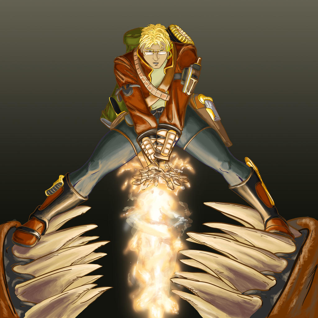
And he's colored!
Gave me fits. It was going great, then suddenly it wasn't, and I got hung up because it felt like the color scheme was *almost* right but something was out of place, so I spent a while tinkering with it to try to figure out what. Finally I put a purple tint to the shading, and it seemed to like that (like I said, this picture has a mind of its own).
I still don't know if this is actually what it "ought" to look like. But for now, I'm finished. I'll start tearing my hair out if I keep messing with it.
Edit: Okay, so not *completely* finished. No one liked the background, which--yes, I'll admit it was lame. And I wasn't happy with the way the black lines looked, so when madmousemedia suggested I turn them a different color, I couldn't resist.
Both excellent suggestions, and thanks to everyone who made them!
Image size
1200x1200px 816.85 KB
© 2009 - 2024 Bluesrat
Comments10
Join the community to add your comment. Already a deviant? Log In
First off let me say this is exceptionally dynamic in pose and theme so you get marks for that right off the bat. The color palette is one I'm found of because of it's earth based scheme. That plays well to the steam punk feel of the piece. Costume and accents also add into this reminding me more and more of the movie the Rocketeer. This person looks believable in the set theme. Lighting and coloring: You're coloring technique leaves it with a painterly feel rather than digitally painted. However I think the lines being black take away from the well placed high lights and pose. They are not finished at the bottom where the teeth are and in some places look heavier than others and i'm not sure why you made those choices where you did. The line weight could use a little more attention if you are going to keep them black other wise I recommend locking the layer and coloring over them with darker but similar colors so that it's not all black. I feel it would give the character more life but that's a personal style choice. The only other things I see that makes me raise a brow is the placement of the feet. The anatomy is stressed in the hands for the magic coming out and the shoulders and upper body push the idea of this is a tense moment, however the feet placement make me feel this character is just standing on the teeth rather than attempting to use their body to keep the mouth open and themselves out of 'the jaws of death' I also think a darker back ground with more glowing effects would push the drama of the work. Grey is so very...nuetral that I think it takes away from your lighting of the boots and coat from the magic effect. I think it would also make the contrasting shadows on the face and upper body stand out more.
Your design and placement as well as effects are high caliber and you're miles a head of me in using the contrasting colors and brushes. This work also makes me smile cause I'm cheering for the spell caster to give old jaws there heart burn. Always good to get your audience emotionally involved. 8.5/10